Haptic Typing
The first is haptic feedback when typing. Yes, many Android devices have had this for a long time. And it’s really strange that Apple hasn’t offered this given that not only have they had their haptic engine in iPhones for years, but it’s arguably the best haptic engine. You should probably tout your strengths? And yet, even with iOS 16, this new functionality isn’t turned on by default. You have to enable it in Settings.
And you should, because it’s great. It’s one of those things where you’re not going to be able to switch to a device that doesn’t have it once it’s on. I know this because I keep typing
on my iPad mini, which has no such engine or feature, and it feels like it’s broken. Maybe that’s why Apple isn’t enabling it by default. It ruins glass typing on other Apple devices.
And might I suggest pairing it with sound? As in, the sound turned on. My phone is almost always muted of any noise, but I’ve long loved the iOS keyboard faux “clicks” and wish I could just turn those on and nothing else. Now I want that even more with haptic feedback. Because it makes typing on the device almost fun. Sort of whimsical.
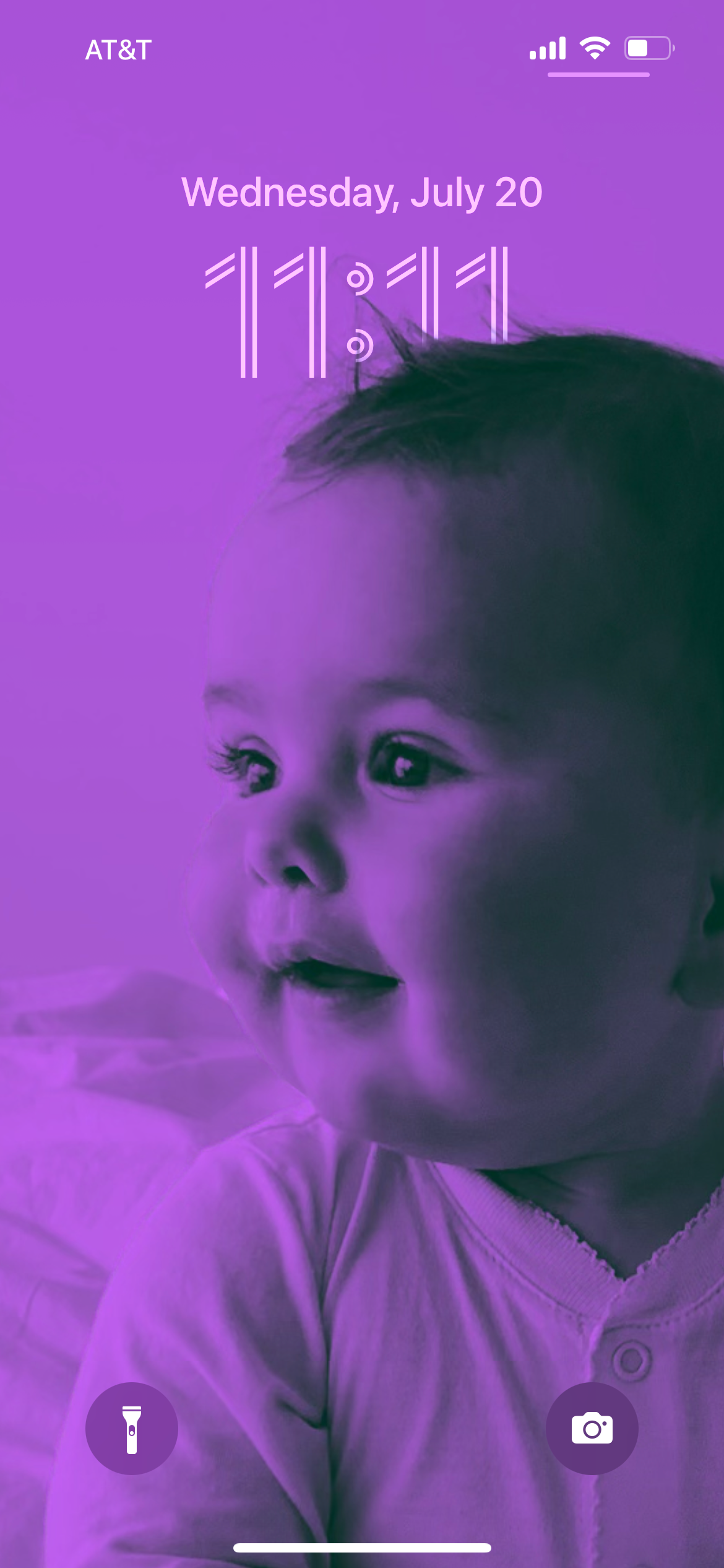
The second killer feature of iOS 16 is the big one. The new lockscreens are fucking amazing. Again, Android has had more customizations for years, and still does, yadda yadda. But Apple nailed this in their first attempt. It’s so good.
Perhaps this shouldn’t be a huge surprise given how much of the UI paradigm is actually borrowed from the Apple Watch, which has similar conventions. That’s a clever cross-pollination. Apple created their UI for the Apple Watch out of form and function limitations and capabilities. But they work brilliantly scaled up too. The complications are great, albeit limited in abundance in the still-beta stage. But things such as subject focus in photos overlaying the time just look stunning. And this depth effect allows the subject to come into frame first when illuminating the screen. So great.
Also stunning, the new typography options. This seems mundane, but when you’ve been staring at the same basic lockscreen aesthetic for 15 years, it’s a massive change. Color options too. And Apple does a nice job suggesting good combinations. Lovely.
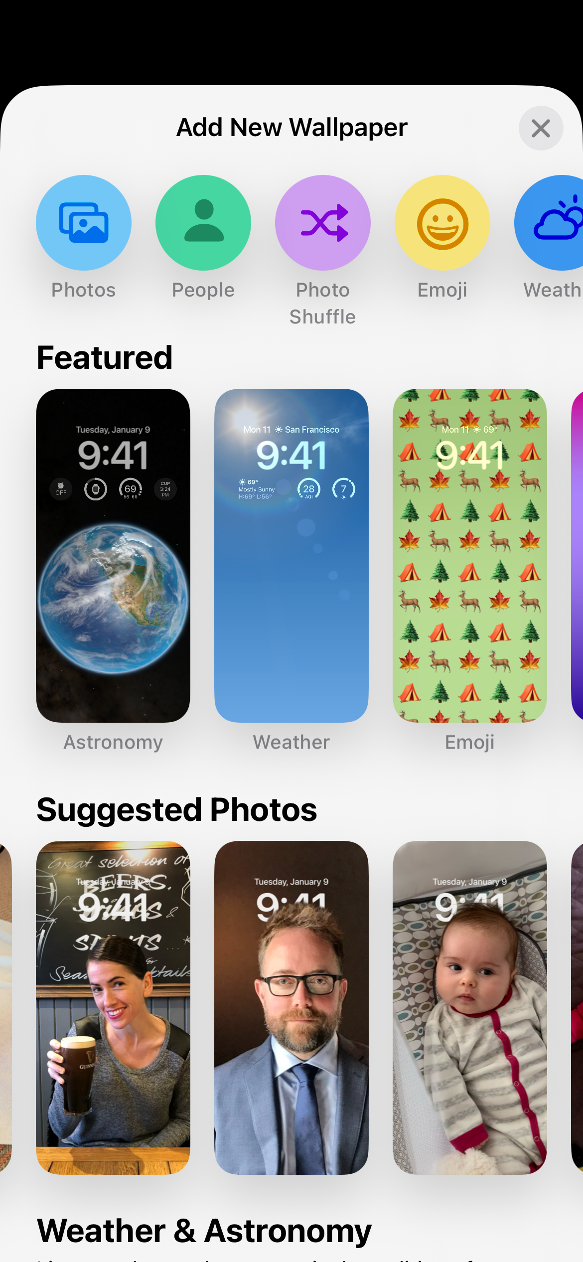
Weather (which can highlight the current weather where you are). Earth and Moon (which show where you are on the Earth or what Moon phase you’re seeing). Photo Shuffle (where you can choose People, Pets, Nature, Cities, or any combo of those — and yes, you can pick which people to showcase). All great.
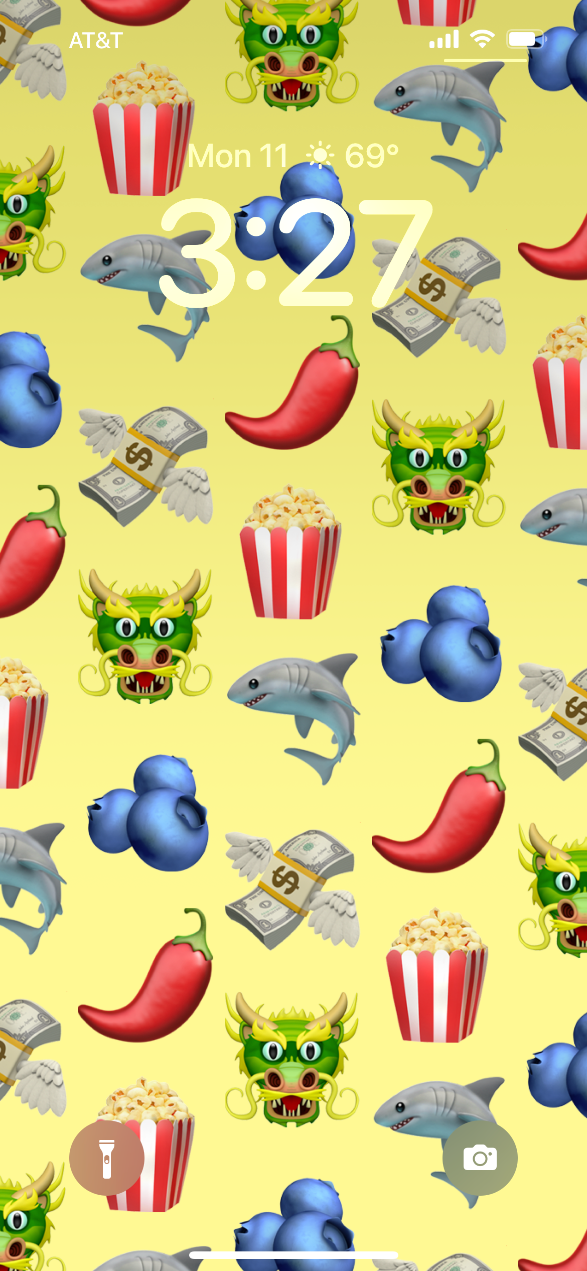
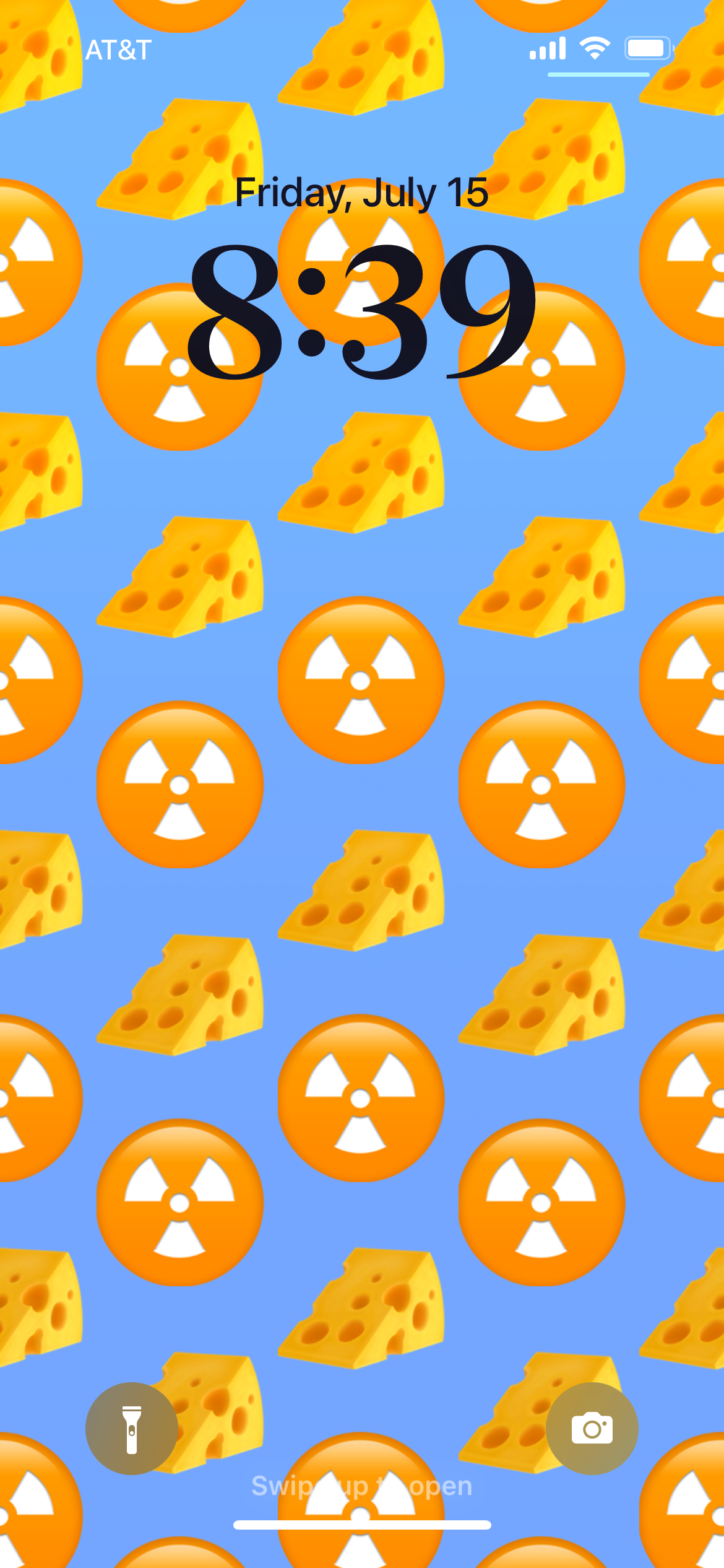
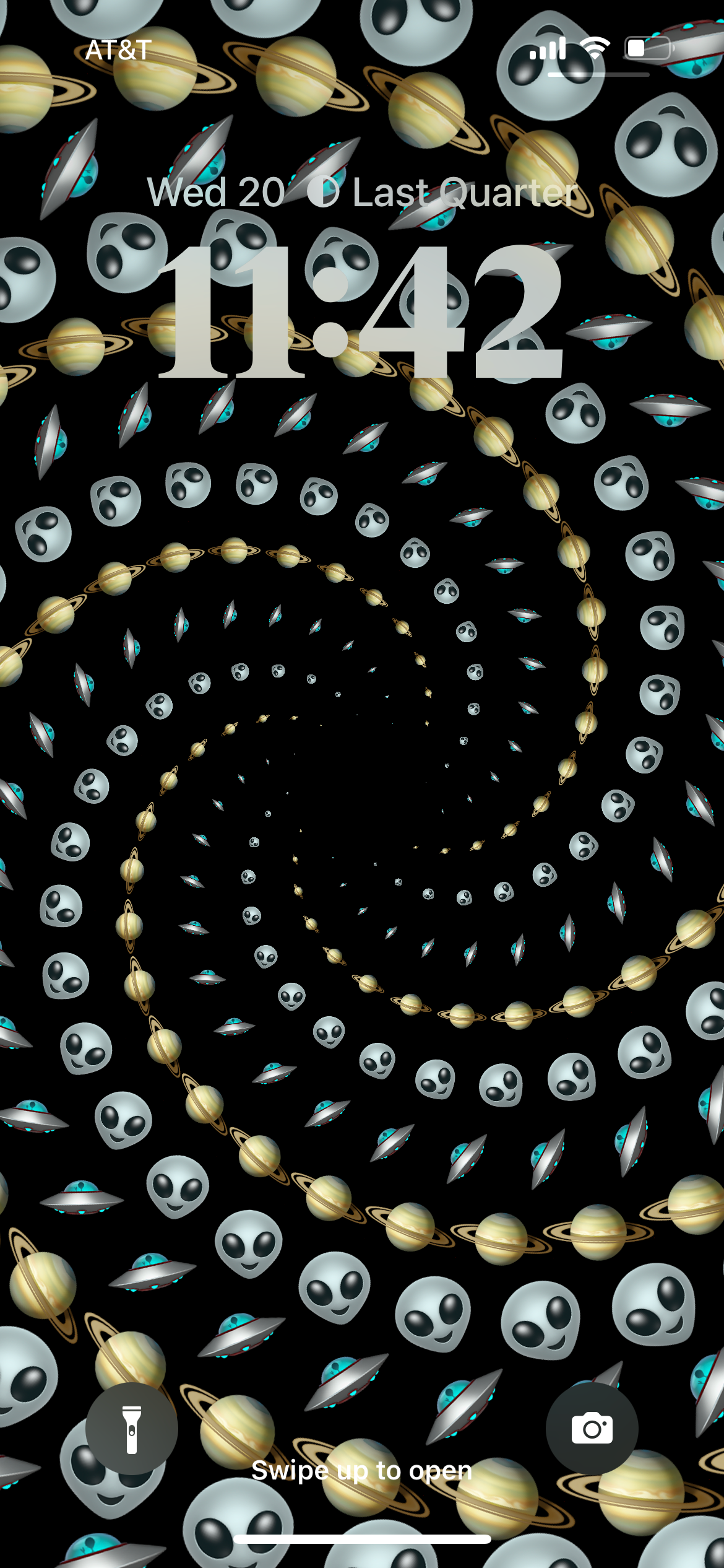
But the real star of the show, at least in this early stage, may be the Emoji. Again, speaking to the notion of working with your strengths, Apple has always had the best emoji. But given that they’re emoji, they’re tiny when used in apps. Apple decided to weave their brilliant designs into the design of iOS 16. You can now mix and match your favorite emoji in ways that are surprisingly satisfying and even gratifying. And just fun.
As someone who has been obsessed with changing their iPhone wallpaper on a regular basis since day one 15 years ago, this new functionality is a godsend. And I’m just mainly impressed by how clever Apple is with their interpretation of how to do this.¹
But that’s not all.

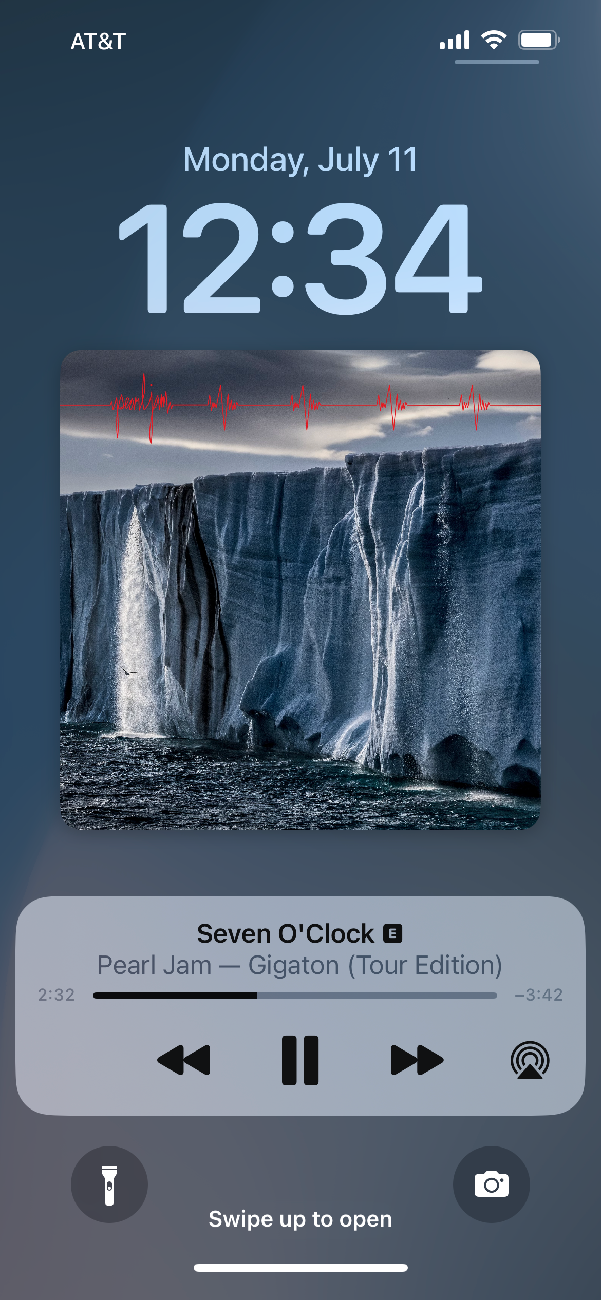
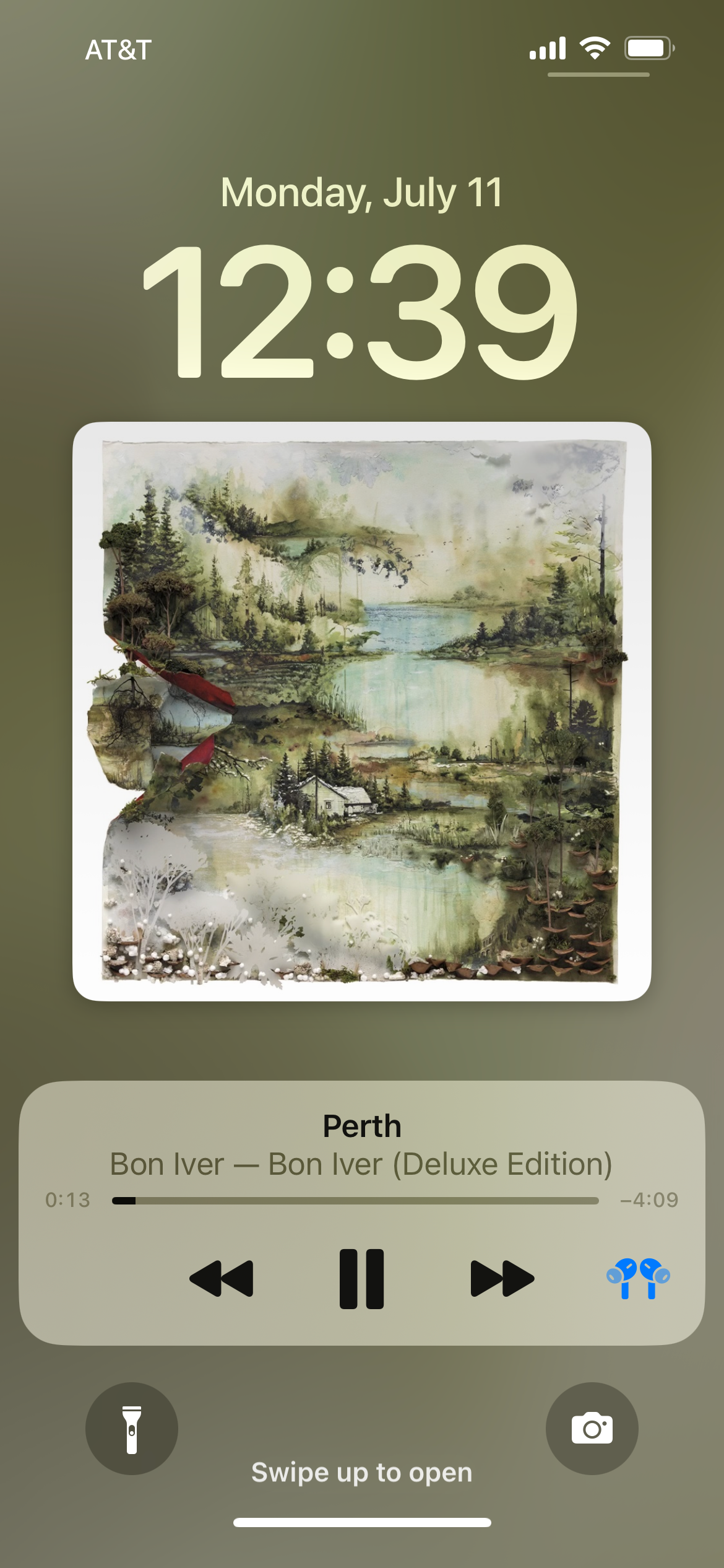
I’ve long harped on the fact that for a company as focused on music as Apple claims to be, they give you a tiny little chiclet for album artwork when playing music on your lockscreen. Give us giant, big, bold album artwork. Like we used to when listening to records, or CDs, or even cassette tapes! That changes in iOS 16 and the result is great. Finally.
Matching the background color to the artwork is the nice type of touch you’d expect from Apple. It’s also nice to be able to “minimize” the artwork if you’d rather keep your lockscreen wallpaper the focal point for whatever reason.
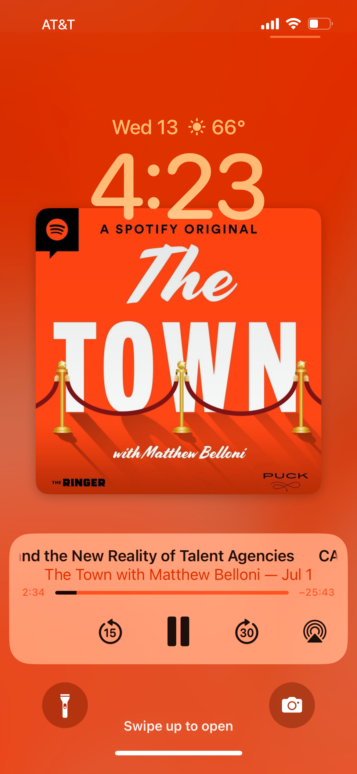
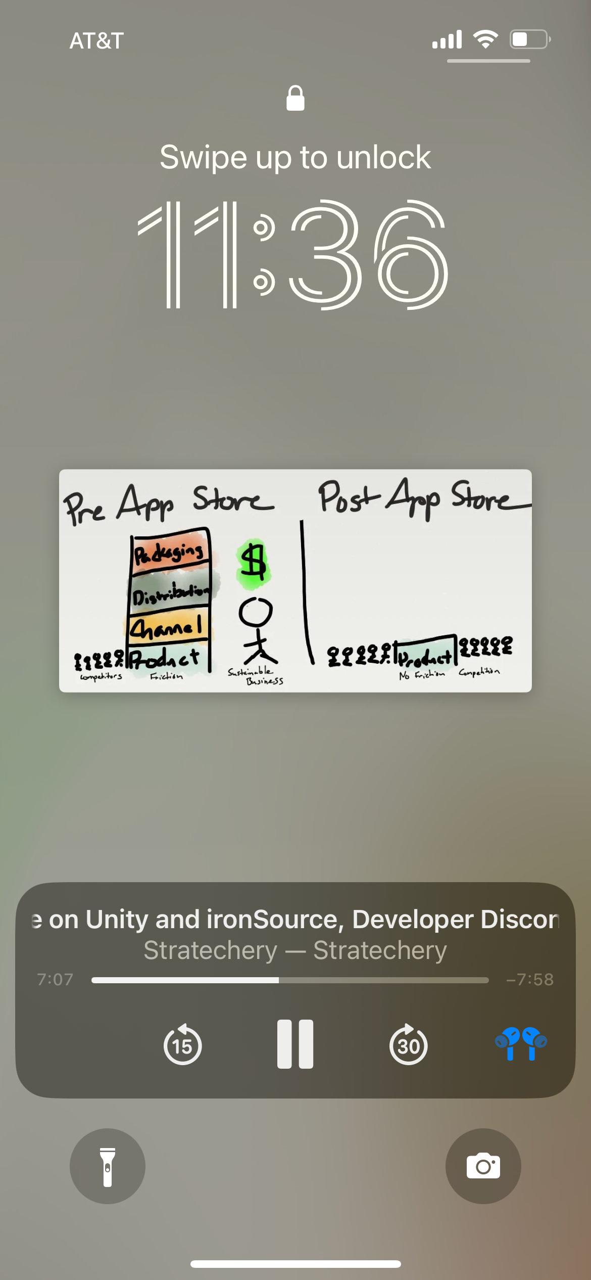
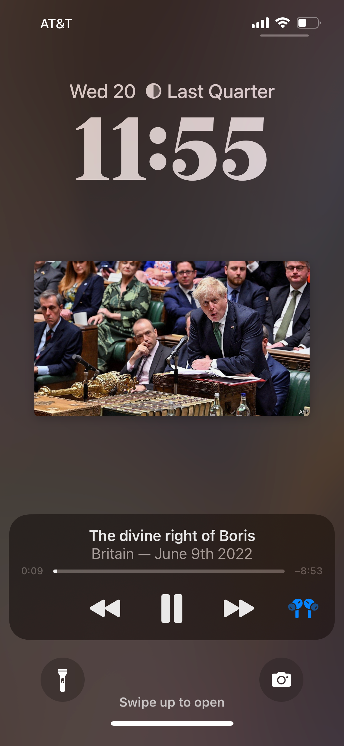
But something else I hadn’t really considered is how much better this same change makes listening to other things on the iPhone. Podcasts, for example, now not only look better with large cover art, but if a podcast has artwork that’s tied to the content, like Ben Thompson’s Stranechary often does, it’s awesome. The images come onto the lockscreen nice and large as they’re being talked about. Same with something like The Economist, which I often listen to via their app. Article images comes through as you listen.
Lastly, I’d just note that it’s great having the controls at the bottom of the iPhone screen rather than in the middle. It’s much easier to navigate with your thumb.
One related element that will be controversial will be notifications coming in from the bottom of the screen. This is nice and makes sense on the lockscreen, but it’s decidedly different when using the main iOS UI, where we’re all used to swiping down to bring up the notification area, which still works, except now you swipe up after the swipe down. It’s… complicated.

¹ You can also set any of these lockscreens to a specific Focus setting. I have not done that yet, but it’s all quite clever and super easy to setup and edit.
Register here and share your opinions in Broadway group chat: https://broadway.africamotion.net/
The first is haptic feedback when typing. Yes, many Android devices have had this for a long time. And it’s really strange that Apple hasn’t offered this given that not only have they had their haptic engine in iPhones for years, but it’s arguably the best haptic engine. You should probably tout your strengths? And yet, even with iOS 16, this new functionality isn’t turned on by default. You have to enable it in Settings.
And you should, because it’s great. It’s one of those things where you’re not going to be able to switch to a device that doesn’t have it once it’s on. I know this because I keep typing
on my iPad mini, which has no such engine or feature, and it feels like it’s broken. Maybe that’s why Apple isn’t enabling it by default. It ruins glass typing on other Apple devices.
And might I suggest pairing it with sound? As in, the sound turned on. My phone is almost always muted of any noise, but I’ve long loved the iOS keyboard faux “clicks” and wish I could just turn those on and nothing else. Now I want that even more with haptic feedback. Because it makes typing on the device almost fun. Sort of whimsical.


Beautiful Lockscreen
The second killer feature of iOS 16 is the big one. The new lockscreens are fucking amazing. Again, Android has had more customizations for years, and still does, yadda yadda. But Apple nailed this in their first attempt. It’s so good.
Perhaps this shouldn’t be a huge surprise given how much of the UI paradigm is actually borrowed from the Apple Watch, which has similar conventions. That’s a clever cross-pollination. Apple created their UI for the Apple Watch out of form and function limitations and capabilities. But they work brilliantly scaled up too. The complications are great, albeit limited in abundance in the still-beta stage. But things such as subject focus in photos overlaying the time just look stunning. And this depth effect allows the subject to come into frame first when illuminating the screen. So great.
Also stunning, the new typography options. This seems mundane, but when you’ve been staring at the same basic lockscreen aesthetic for 15 years, it’s a massive change. Color options too. And Apple does a nice job suggesting good combinations. Lovely.
Weather (which can highlight the current weather where you are). Earth and Moon (which show where you are on the Earth or what Moon phase you’re seeing). Photo Shuffle (where you can choose People, Pets, Nature, Cities, or any combo of those — and yes, you can pick which people to showcase). All great.
But the real star of the show, at least in this early stage, may be the Emoji. Again, speaking to the notion of working with your strengths, Apple has always had the best emoji. But given that they’re emoji, they’re tiny when used in apps. Apple decided to weave their brilliant designs into the design of iOS 16. You can now mix and match your favorite emoji in ways that are surprisingly satisfying and even gratifying. And just fun.
As someone who has been obsessed with changing their iPhone wallpaper on a regular basis since day one 15 years ago, this new functionality is a godsend. And I’m just mainly impressed by how clever Apple is with their interpretation of how to do this.¹
But that’s not all.


Media Controls
I’ve long harped on the fact that for a company as focused on music as Apple claims to be, they give you a tiny little chiclet for album artwork when playing music on your lockscreen. Give us giant, big, bold album artwork. Like we used to when listening to records, or CDs, or even cassette tapes! That changes in iOS 16 and the result is great. Finally.
Matching the background color to the artwork is the nice type of touch you’d expect from Apple. It’s also nice to be able to “minimize” the artwork if you’d rather keep your lockscreen wallpaper the focal point for whatever reason.
But something else I hadn’t really considered is how much better this same change makes listening to other things on the iPhone. Podcasts, for example, now not only look better with large cover art, but if a podcast has artwork that’s tied to the content, like Ben Thompson’s Stranechary often does, it’s awesome. The images come onto the lockscreen nice and large as they’re being talked about. Same with something like The Economist, which I often listen to via their app. Article images comes through as you listen.
Lastly, I’d just note that it’s great having the controls at the bottom of the iPhone screen rather than in the middle. It’s much easier to navigate with your thumb.
One related element that will be controversial will be notifications coming in from the bottom of the screen. This is nice and makes sense on the lockscreen, but it’s decidedly different when using the main iOS UI, where we’re all used to swiping down to bring up the notification area, which still works, except now you swipe up after the swipe down. It’s… complicated.


¹ You can also set any of these lockscreens to a specific Focus setting. I have not done that yet, but it’s all quite clever and super easy to setup and edit.
Register here and share your opinions in Broadway group chat: https://broadway.africamotion.net/


